Kokoschka Fonts
?c8f5)
?bb5d)
?2f9c)
?2f6e)
?ab38)
?3a9f)
?eb7f)
?a633)
?ba7e)
?46e9)
?601b)
?383c)
?9eaa)
?0792)
?75c1)
?1c7f)
?bb12)
?695d)
?ade6)
Your text here
Your text here
Your text here
Your text here
Buy Kokoschka
1. Select Style
| Kokoschka Family Styles included • Extras • Printed • Regular • Regular Oblique $79.99 |
|---|
2. Select License
Your selection
Subtotal
$0.00
State and local taxes may apply.
Please select fonts and licenses.
Please select at least one license.
Please select some fonts.
Name
Description
$0.00
Kokoschka
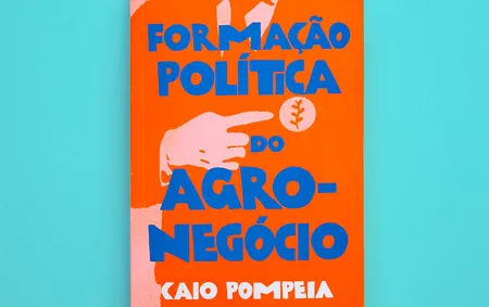
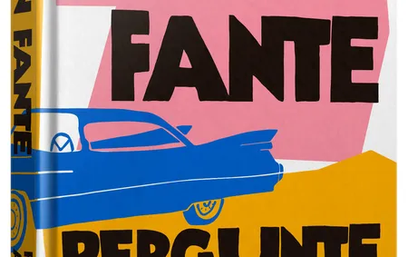
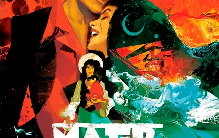
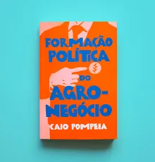
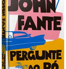
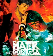
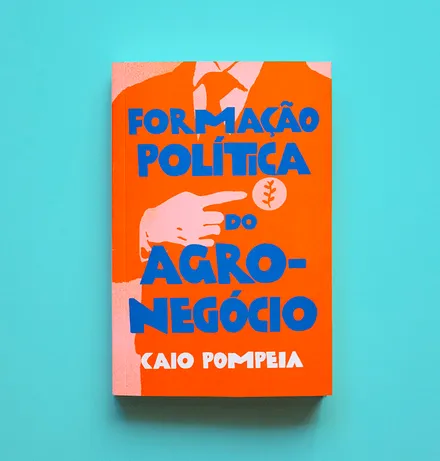
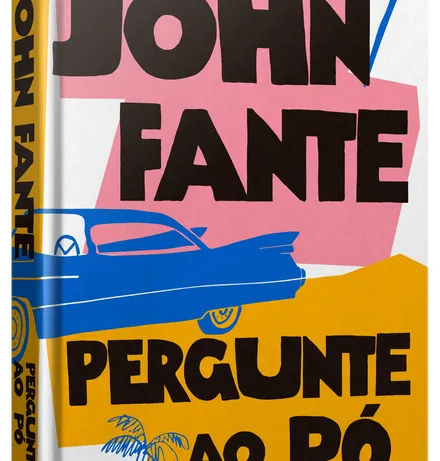
Kokoschka is a dense and strong display font inspired by the lettering on the poster of a short Expressionist play by Austrian painter, printmaker, and writer Oskar Kokoschka from 1909. Suppose the typeface itself is already profoundly vigorous. Use the ligatures and alternates for a more realistic, hand-lettered feel. The family includes a nice textured version, an oblique, and a very handy assortment of extras — ideal for book covers, film titles, concert posters, and food packaging, too!
OpenType Features
OpenType Features
- Common Ligatures
- Stylistic Alternates
- Stylistic Sets
Language Support
Language Support
- Catalan
- Croatian
- Danish
- Dutch
- English
- Filipino
- Finnish
- French
- Fula
- German
- Hungarian
- Indonesian
- Italian
- Malay
- Maltese
- Norwegian
- Portuguese
- Romanian
- Slovenian
- Spanish
- Swedish
- Turkish