Fonts in Use: Daft Brush
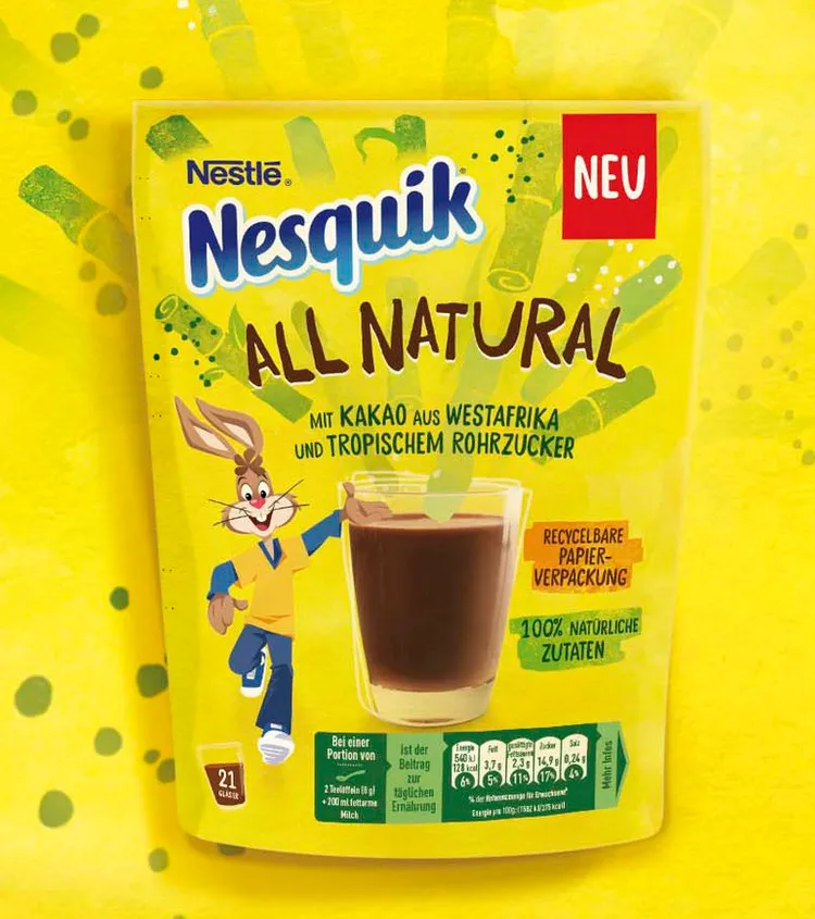
Nesquik

Nesquik
How cool to see our fonts Daft Brush and Stick-A-Round in action in Nestlé’s Nesquik All Natural packaging.
From ROMAN KLIS DESIGN website:
In order to authentically communicate the product benefits of sustainability and naturalness of the new sub-brand, we created an approachable and friendly tonality that communicates the topic of recycling in an understandable way without being preachy. In line with the design trend “be open, honest and transparent”, we not only visually translated the origin and naturalness of the products’ ingredients, but also verbally and visually emphasized the sustainability approach of the packaging. In addition, we translated the iconic brand attributes of Nesquik All Natural in such a way that mothers went from gatekeepers to brand advocates.
Nesquik All Natural is a starting point for Nestlé’s commitment to offer more natural, sustainable and nutritious products while retaining the great taste that people know and love.”
(translated from German by Google)


